
Microsoft recently released Windows 10, an attempt at unifying the desktop and mobile experiences through a single unified interface. When it comes to mobile, Microsoft hasn’t had the best of luck. Windows 8 (and 8.1) were attempts at bridging the two worlds of desktop and tablet but only optimizing for the merged cases. Windows 10 seems to be a drastic revisit of these assumptions. I did a fresh install of Windows 10 to see how the experience would be for the new user and here’s what I found.
First Power On
Upon a fresh install of the system, you get a clean screen that explains in pretty human terms what you need to do to set up. There were a few nice features like Wi-fi network sharing (No more asking for passwords!), and individual customization of privacy preferences. The downs? There’s still a merging of Microsoft accounts with the PC account which still feels really odd to use even with the nice sync features. The privacy defaults are also pretty alarming. One of the screens states (if you use the defaults) that Microsoft will use your keyboard input, pen input, voice, etc. to customize your experience. It seemed like a little much to me and the fact that a lot of the power features (like Cortana mentioned later) require this or a large set of them.
Desktop or Tablet?
One of the small features that made me really happy is the fact that you can really use Windows 10 as a desktop or tablet and it’s seamless to transition between the two. I’m running Windows 10 on the Surface 3 and as soon as I flip the keyboard back (or disconnect it) it knows to switch to a tablet mode and optimize for that case.
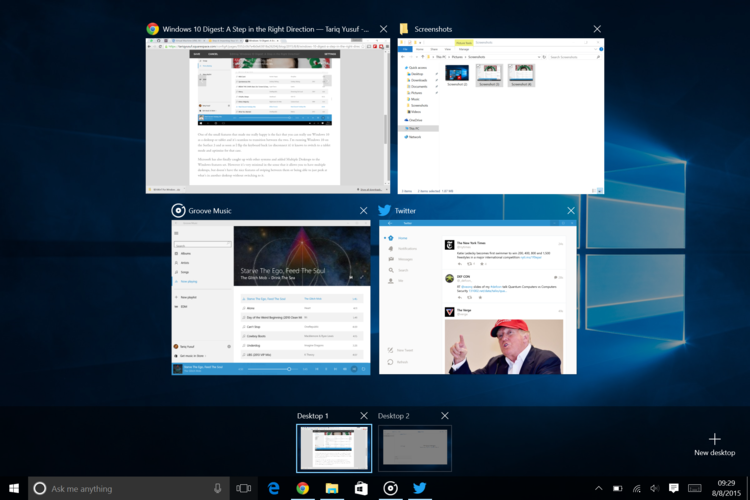
Microsoft has also finally caught up with other systems and added Multiple Desktops to the Windows features set. However it’s very minimal in the sense that it allows you to have multiple desktops, but doesn’t have the nice features of swiping between them or being able to just peek at what’s in another desktop without switching to it.
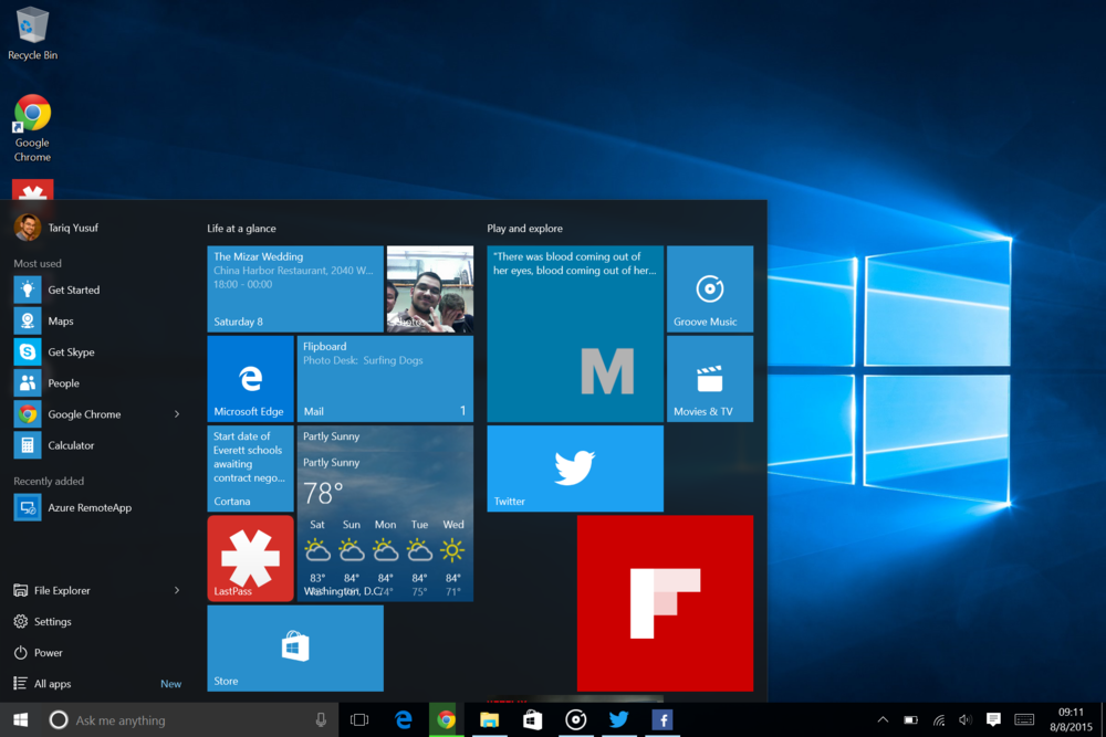
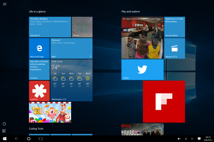
The start menu is also back, but not as you might remember it. On the desktop experience, you have a sort of mini start screen on the right hand side with what you typically think of as your traditional start menu on the left hand side. I find it’s a nice compromise between the two interfaces and still gives you easy access to nice features like search and all apps (which also has it’s niceties in the tablet mode start screen).
Cortana
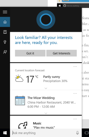
It’s the nerd trump card and Microsoft played it well. Cortana appears to be more Microsoft’s answer to Google Now than Siri. Occasionally it will show a message in the search box letting me know of an event or suggesting something I might like to know. The voice recognition technology is quite mature and detects most of my complex statements on the first try.
Unfortunately, it comes at a cost, Cortana requires a whole bunch of permissions to even begin working. Unlike Google Now which is fine using subset of the permissions, Cortana appears to request a large amount whether you use them or not. Immediately after starting it, I was asked to provide location access and input personalization before microphone input which seemed quite odd to me. I was only asked to provide microphone access once I tapped the new microphone icon that showed up.
On the bright side, Microsoft makes it easy to just use the normal search feature without enabling Cortana which was one of my favorite Windows 8 features.
Microsoft Edge

Edge feels like what Google Chrome used to be: simple, clean, and getting you exactly where you want to go. It’s a really simple browser that just starts up and goes to where you want. Unfortunately you still have the zombie ruins of it’s begrudged forefathers that refuse to render certain web pages. I’m not talking about sites that block rendering like WhatsApp, I’m talking about websites that should render like Google Play Music’s web interface or even GitHub.
Edge appears to be going the same route as Chrome in the sense that it’s starting out simple and will flex as demand decides. I’m looking forward to features like add-on support from Chrome and Firefox but it really feels like something that should’ve shipped with the browser as a default features. Because of this, it’s really too early to tell and not all that useful in it’s current state.
Overall Impression
I think Microsoft is definitely taking a better direction this time around. Some of it’s ghosts from Windows 8(.1) are still haunting it like the assumption that everyone is a power user in some of the small feature details. For the first time in a while, I’m excited to see what Microsoft does with Windows from here and what’s coming next.
-T